
Branding & Loghi.
Not mere graphic signs, but visual systems that tell stories before a single word is read. Every logo begins with a precise process: listening to the client, analysing the sector, searching for a visual idea that is scalable, lasting, and impossible to confuse with any other brand.
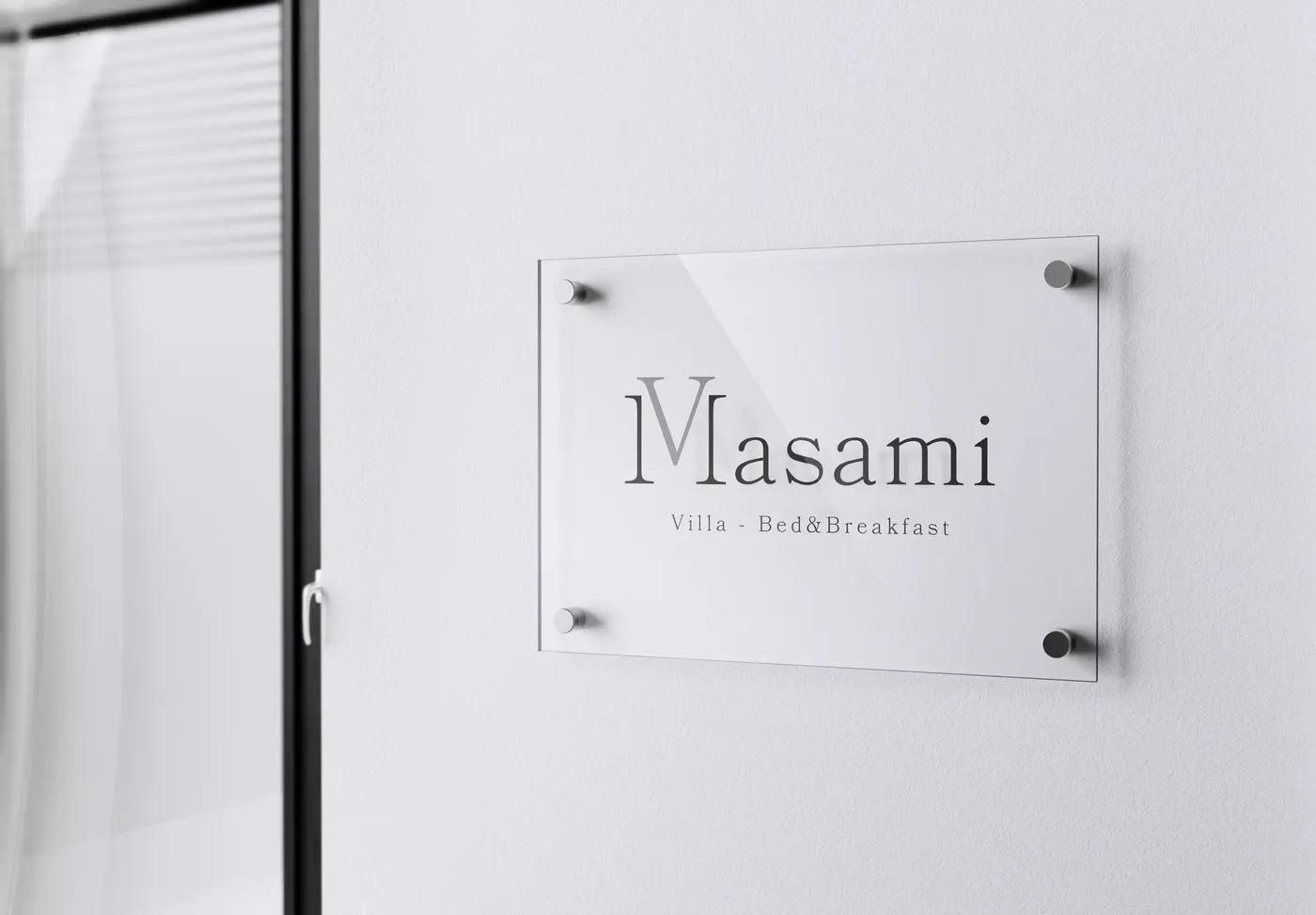
Villa Masami
Brand & Logo Design • UI/UX Design • WebThe Villa Masami identity was born from a geometric intuition: merging the M and V of the name into a single, clean, scalable pictogram. Approved on the second proposal, the mark functions as logo, favicon, stamp, and decoration — a visual system built to last and adapt to any surface. The warm palette and balanced typography complete an identity that conveys the quiet elegance of Sicilian hospitality without stereotypes.
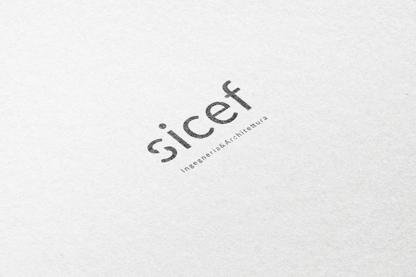
Sicef
Brand Identity • Corporate & Logo DesignSicef is a corporate brand requiring immediate authority and scalable recognisability. The choice of Lato — strong, geometric, international — conveys institutional solidity. The 's' with its diagonal cut becomes an autonomous pictogram: an icon that lives independently of the logotype and functions at any scale and in any context, from email signature to corporate signage.
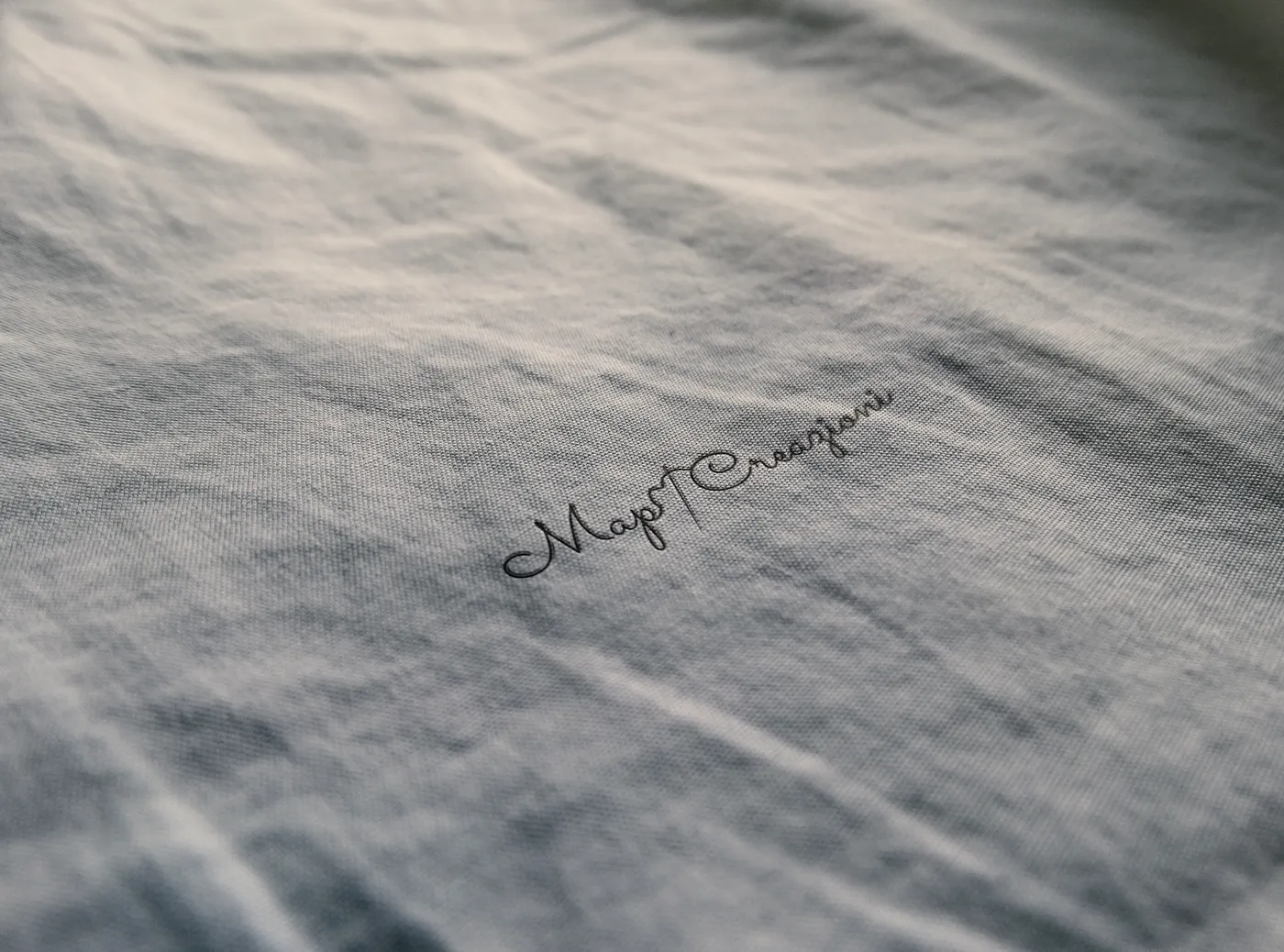
Mapi Creazioni
Visual Identity • Branding & DesignMapi Creazioni crafts objects entirely by hand. The logo tells this story with an essential pictogram: needle and thread, drawn with a thin, elegant stroke that mirrors the precision of handmade work. The Sacramento font adds the calligraphic touch of the artisan's signature — personal, authentic, impossible to replicate. A logo worth as much as what it represents.